
Visual System
Logo suite, colour, typography, clear space and misuse, downloads.
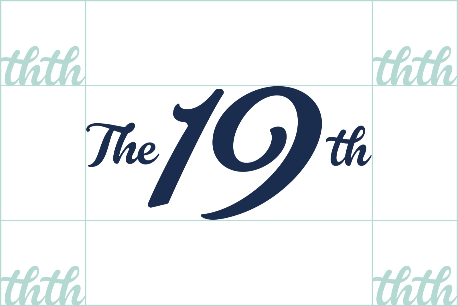
Logo
Lead with the flag.
The flag badge is the primary mark — self-contained, so it needs no divider. Never re-type the name; always use the supplied artwork.

Variations

Flag badge — reversed
For navy backgrounds — the sea-glass flag on deep navy.

Wordmark
Strong enough to stand alone at scale — signage, shirts, the head of a banner.

Small-use mark
Drops "The" to keep "19th" legible at tiny sizes — favicons, app tiles, stitched detail.
Clear space
Keep that clear space on every side. Nothing — type, edges or other logos — enters the zone.
Minimum size
 Badge · 40pxWordmark · 120px
Don't

Colour
Navy leads. Sea-glass supports. White breathes.
Two colours carry the identity; white keeps them breathing. Click any block to copy its hex.
- Role
- Primary
- Hex
- #1A2D4E
- RGB
- 26 · 45 · 78
- CMYK
- 67 · 42 · 0 · 69
- Pantone
- 533 C *
- Role
- Secondary
- Hex
- #B4D9D2
- RGB
- 180 · 217 · 210
- CMYK
- 17 · 0 · 3 · 15
- Pantone
- 565 C *
- Role
- Neutral
- Hex
- #FFFFFF
- RGB
- 255 · 255 · 255
Balance
Navy ↔ sea-glass ≈ 9.1:1 and white ↔ navy ≈ 13.9:1 — both pass WCAG AA & AAA, either way round. Don't set sea-glass as text on white — it's an accent and background colour only. Pantones are nearest matches; confirm a spot swatch with your printer.
Typography
Satoshi — caps that carry, body that breathes.
One typeface, two registers: all-caps for headings and callouts, sentence case for everything you read.
ABCDEFGHIJKLMNOPQRSTUVWXYZ
0123456789
@!£%&?/*
The 19th headings with Satoshi
Satoshi Variable headings. 12px or 6px letter-spacing depending on character length.
Headings
Founding memberships
Satoshi Bold / Black · ALL CAPS. Caps with light letter-spacing (≈40–80 units). Build hierarchy with weight, not extra colours.
Body & UI
Book a bay, bring a few people, and play.
Satoshi Medium · Sentence case. Body 10–11pt, line-height ≈1.5, reading measure 45–75 characters. Tabular numerals for prices and times.
Weights
The script "The / th" and the "19" in the logo are custom lockup artwork, not a font. Never re-type the name to imitate it — always use the supplied logo files. Satoshi is free from Fontshare (fontshare.com).
Downloads
Take the assets with you.
The full logo suite and the typeface — vector, web-ready and ready to use.
The designed sections above show the system in use — the marks, the palette wall, the type. The written rules and exact values are below, and they’re the source of truth for anyone (or any AI) briefing a print run or building a screen.
Logo
The flag badge is the primary mark. It is self-contained, so it never needs a divider between it and adjoining text. Lead with it for avatars, balls, banners and signage. Use the wordmark where the logo runs large and alone. Drop to the small-use mark (which drops “The”) only when space is genuinely tight.
The script “The / th” and the “19” are custom lockup artwork, not a font. Never re-type the name in another typeface to imitate it — always use the supplied files. Single-colour knockouts (White, Black, Deep Navy) are the one-ink versions for flexible printing.
On navy, the logo reverses to sea-glass. On light or sea-glass grounds, it sits in deep navy.
Colour
Navy leads, sea-glass supports, white breathes. Balance roughly navy 60 / sea-glass 30 / white 10. (Full RGB / CMYK / Pantone values are on the colour panel above and in /llms.txt.)
| Colour | Hex | Use |
|---|---|---|
| Deep Navy | #1A2D4E | Primary. Backgrounds, type, the dominant 60%. |
| Sea-Glass | #B4D9D2 | Secondary. Accents, fills, the reversed logo. |
| White | #FFFFFF | Clean space, and emphasis text on navy. |
Contrast: navy ↔ sea-glass ≈ 9.1:1 and white ↔ navy ≈ 13.9:1 — both pass WCAG AA & AAA, either way round. Sea-glass fails as text on white — use it as an accent or background only, never as body text on a light ground. Pantones are nearest matches; confirm a spot swatch with your printer.
Typography
Satoshi throughout (free from Fontshare, web-ready).
- Headings & callouts — Bold / Black, ALL CAPS, light letter-spacing (≈40–80 units). Build hierarchy with weight, not extra colours.
- Body & UI — Medium, sentence case. Body 10–11pt, line-height ≈1.5, reading measure 45–75 characters. Numerals are tabular-friendly for prices and times. Satoshi is used at Medium, Bold and Black only — never Light or Regular.
Clear space, size & misuse
- Clear space: at least 2x the height of the “th” on every side. Nothing — type, edges or other logos — enters that zone.
- Minimum size: badge 12mm / 40px; wordmark 22mm / 120px. Below these, switch to the small-use mark — the full lockup breaks up.
- Don’t: stretch or squash · rotate or tilt · recolour off-palette · add shadows or effects · place on busy / low-contrast grounds · recreate or re-type it.
Master assets
Flag badge (full), small-use mark and wordmark are supplied as vector SVG in Deep Navy, Sea-Glass, White and Black, with PNGs for quick placement. Grab them from the downloads above. Need another format? Just ask.